Save As output looks different from original

Here everybody can post his problems with PhotoLine
SarahNewton
Mitglied
Beiträge: 8
Registriert: Sa 21 Nov 2015 16:59

Save As output looks different from original

Beitrag von SarahNewton »

Hi everyone,

I've recently started to realise that when outputting from Photoline, images are looking subtly different. Often they're less vivid, slightly duller, and I'm wondering what I'm doing wrong.

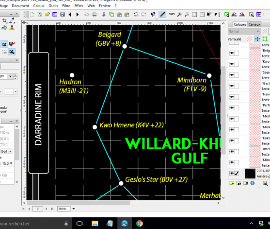
Here's a simple 8-bit RGB image I'm working on in Photoline, saved as a .PLD image:

Bild

...and here's the output when I export to a .PNG:

Bild

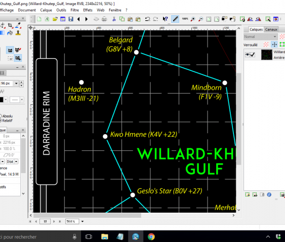
Can you see how the green text looks like a different font, like it's lost the bold face, etc?

Maybe I'm making a really basic mistake here, but can anyone see what I might me doing wrong? I'm exporting the PLD file to PNG, no compression, no colour reduction. The font I'm using is ADAM.CG PRO.

Hoping you can help!

Many thanks,

Sarah
bkh
Betatester
Beiträge: 3674
Registriert: Do 26 Nov 2009 22:59

Re: Save As output looks different from original

Beitrag von bkh »

You are showing both files at 50% magnification, so this might be due to different scaling algorithms used for text and bitmap graphics. If I create a copy of a text layer, convert that to RGB and look at the document at magnifications below 100%, the output looks different, too. At 100%, they are identical.

Does the output still look different if you compare the results at 100%? What if you turn Pixel Mode on in PL (in the View menu)?

Cheers

Burkhard.
SarahNewton
Mitglied
Beiträge: 8
Registriert: Sa 21 Nov 2015 16:59

Re: Save As output looks different from original

Beitrag von SarahNewton »

Hi Burkhard,

Many thanks for the quick reply! :)

The difference persists at 100%, but when I turn Pixel Mode on, the PLD file changes completely, and now looks like the PNG file, but only at 100%. So what I'm seeing in PLD is what I'm getting in the output. That's exactly what I wanted, although I'll now need to modify my original PLD file to get it to look how I want! Unfortunately, the difference returns when I zoom out to 50%, even with Pixel Mode on, which is a bit of a pain - I'd been hoping to be able to work on a file with it looking how it should do when output!

To be honest, I'd never even heard of Pixel Mode before, and I still don't know what it is - I'm going to have to do some research! I certainly find it necessary to have the screen displaying what I'm likely to get on output, and I'm not sure why anyone wouldn't want that (ie have Pixel Mode switched off).

Thanks very much indeed for your help!

All the best,

Sarah
bkh
Betatester
Beiträge: 3674
Registriert: Do 26 Nov 2009 22:59

Re: Save As output looks different from original

Beitrag von bkh »

Just tried your font in macOS and can't really reproduce the problem at 100%. But then I didn't find a bold font variant. On macOS, I can't use "Bold" at all. Maybe Windows creates a bold substitute which PL doesn't render. I'm not exactly sure in which circumstances font rendering is done in PL vs. the OS.

Do you get the same problems/differences with the regular variant?

Anyhow, afaik pixel mode only works at 100% or above. Sometimes, it's nice to see text or vector graphics rendered as pixels, sometimes it's an advantage to display those shapes as smooth shapes at higher magnifications (especially when you work with vector output, e.g. PDF or SVG, where pixels don't have a meaning). Just keep pixel mode switched on if that works for you.

Cheers

Burkhard.