I've recently started to realise that when outputting from Photoline, images are looking subtly different. Often they're less vivid, slightly duller, and I'm wondering what I'm doing wrong.
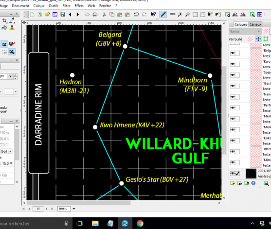
Here's a simple 8-bit RGB image I'm working on in Photoline, saved as a .PLD image:
...and here's the output when I export to a .PNG:
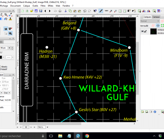
Can you see how the green text looks like a different font, like it's lost the bold face, etc?
Maybe I'm making a really basic mistake here, but can anyone see what I might me doing wrong? I'm exporting the PLD file to PNG, no compression, no colour reduction. The font I'm using is ADAM.CG PRO.
Hoping you can help!
Many thanks,
Sarah
