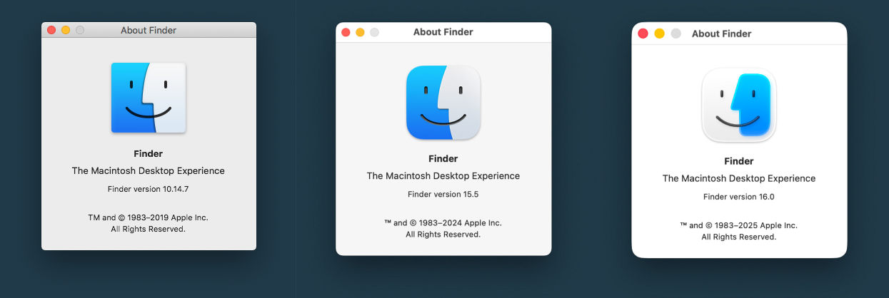
Apple just introduced concept of next UI, and seems window corners became even more rounded, brighter and titlebars are larger than in Big Sur+ (which already looked too rounded, too bright and too thick compare to Catalina). This is totally unpractical and will make PhotoLine document window look even more strange and unproportional compare to rectangle panels.
PhotoLine macOS version really needs an option to use fully themmed single rectangle window mode, same as currently used in Windows version.
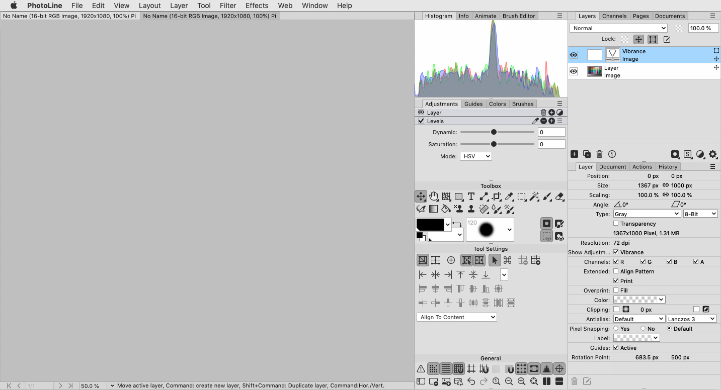
If again imagine some more complex UI improvements, here is how it may look on macOS (and Windows as well):
Panels without drop shadows.
Removed additional window top titlebar.
Compact sized document tabs.
Compact sized bottom window bar.
Uniform gray background without large areas of pure white color across all panels.
Themmed sliders and boxes.
To reduce tabs length and make titles shorter, info in () could be fully or partially removed from there, because same info already available in Layer Attributes and bottom window bar.
shijan hat geschrieben: Mi 11 Jun 2025 23:20
Apple just introduced concept of next UI, and seems window corners became even more rounded, brighter and titlebars are larger than in Big Sur+ (which already looked too rounded, too bright and too thick compare to Catalina). This is totally unpractical and will make PhotoLine document window look even more strange and unproportional compare to rectangle panels.
PhotoLine macOS version really needs an option to use fully themmed single rectangle window mode, same as currently used in Windows version.
shijan hat geschrieben: Mi 11 Jun 2025 23:20
Apple just introduced concept of next UI, and seems window corners became even more rounded, brighter and titlebars are larger than in Big Sur+ (which already looked too rounded, too bright and too thick compare to Catalina). This is totally unpractical and will make PhotoLine document window look even more strange and unproportional compare to rectangle panels.
PhotoLine macOS version really needs an option to use fully themmed single rectangle window mode, same as currently used in Windows version.
That is a godawful UI!!!! How the mighty fall.
I liked the look of the far left slightly rounded windows. The center one was already too much in my view. The new design? What's next? Circular windows? Bubbles? The designers also butchered the Finder logo, btw: it is meant to symbolize a (user) face in front of a Mac screen, and looked really nice (the rounded version in the center version already began to mess with that symbolism). The new version is a blurry mess and lost its nice symbolism.
I personally still use macOS 10.14 version (the left one) customized with system icons from older macOS 10.9 version. It blends with PhotoLine UI rather well. The main problem is that it is rather outdated OS and more and more new versions of the apps don't supported on this system.
Starting from macOS 11 they start to make UI look like iOS. This is totally stupid idea because things that looks well and works well on small touchscreens, don't looks well and don't works well on large computer screens with mouse. They lost that feeling of original Mac UI idea, which was almost unchanged from early 2000. Newest version with ugly Finder logo even don't supported on my hardware and is the last version that will work on Intel CPU, so lucky i will never use it.